

Role
Product Designer
User Researcher
Interaction Designer
teams
Engineering
Sales
Leadership
Summary
Oncue is a web-based booking and operations platform for small moving companies.
This project involved a complete restructuring of the platform’s information architecture and significant revaluation of user needs.

Background
As business expands or contracts seasonally, Oncue has to keep up and present relevant data, helping business owners not only manage daily operations, but also evaluate the health of their business. Our dashboard, such as it was, was not meeting our user’s needs.
I worked with moving company owners, internal sales reps, leadership, and engineering to learn more about their needs. I worked with customers to learn how they currently stay in the loop with both the sales sides of their company as provided by Oncue sales reps, and the operations side of the business, keeping a watchful eye on the servicing of on-going moves. I learned that our business owners want to feel engaged, they want to be able to take it all in at a glance, and dig into the data if necessary.
Users
Oncue’s business owners
Internal customer success team
Internal sales team
Needs
Oncue to perform as a business tool
Day-to-day operations updates
Sales and lead source performance
Wants
Feel connected and in control at all times
Know how moves are progressing, how customers are feeling, and what cashflow is looking like
Surface the value of Oncue
Challenge
How can we build an analytics dashboard that keeps our movers in the know and transforms Oncue into a viable and must-have business tool?
Goals
Transform UI utilizing Material UI and React
Identify user wants and needs
Distill needs into actionable and concise sections within the analytics dashboard
Deliverables
User research evaluations
UI sketches
Wireframes
High fidelity mockups
Developer specs
Tools
Pencil & Paper
Slite (specs & documentation)
Figma
Sketch (earlier iterations)
Slack (team communication)
Jira (task management)
chart.js (data visualization)
Approach
I broke the problem into four sections: Review, Define, Design, Validate.
Review
An audit of the dashboard revealed that I would be approaching this project with a wealth of useful data. One thing working in my favor was that I had undertaken a redesign of the platform’s MVP dashboard previously and understood the decisions made.
This phase also involved extensive conversations with business owners, Oncue’s internal customer success team, and leadership.
The dashboard used tabbed navigation to keep information focused and differentiate between the analysis of past performance and the tracking of current and upcoming business.
User feedback revealed that tabs were underutilized, and even missed by some users.

Define
Research and interviews conducted in the Review phase surfaced some interesting feedback that helped me to identify user needs and wants. During this phase I did the following:
Collaborate with business owners to identify information critical to running their businesses.
Deep dive into the data available within Oncue and work with engineering team to present data in actionable ways.
Explore IA and user flow changes
Design began with pencil & paper and ran through numerous design iterations before moving into Figma.
Designs in Figma were refined over a series of critiques and reviews with business owners, sales reps, and Oncue leadership. However, design was not finalized prior to my departure from Oncue.
Wireframes
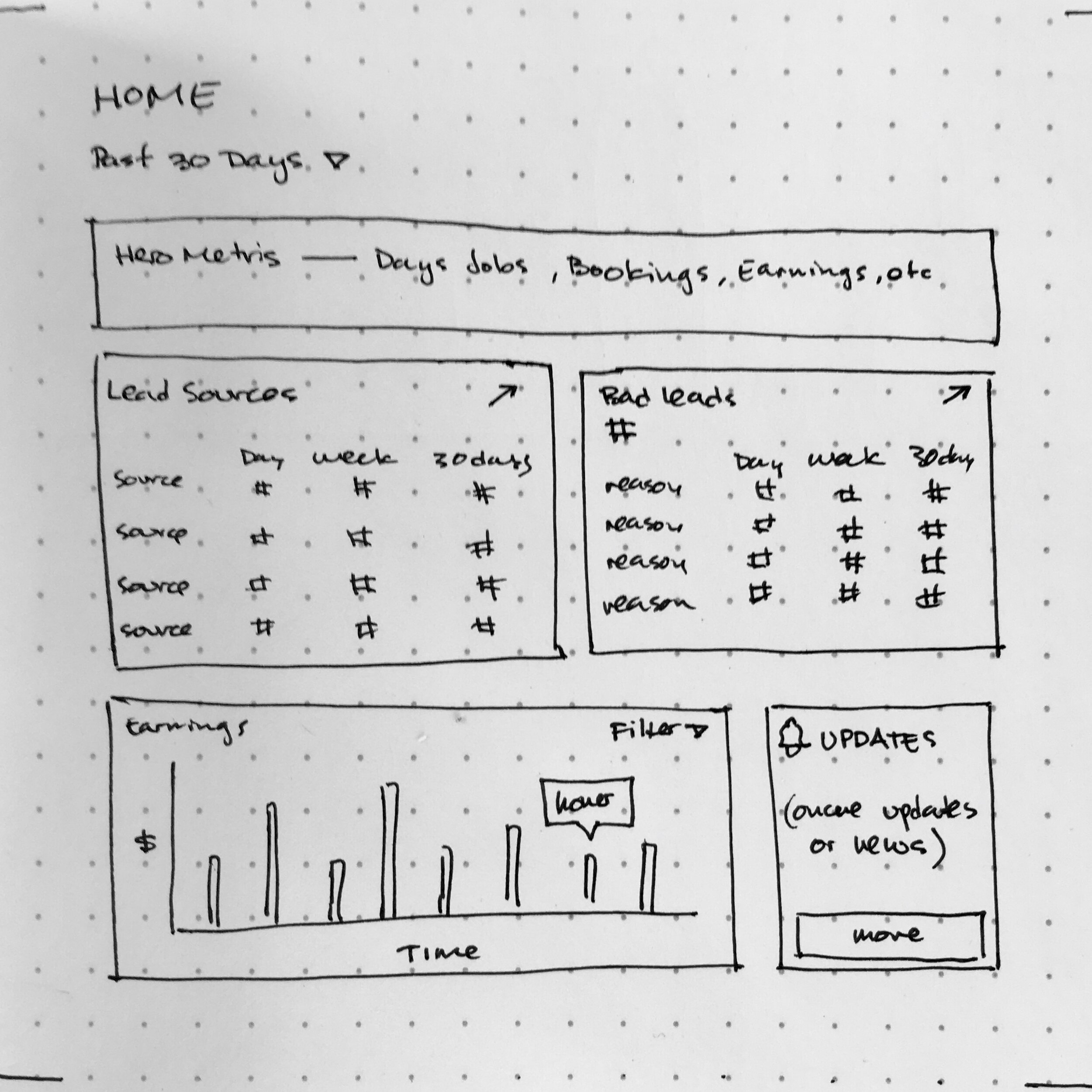
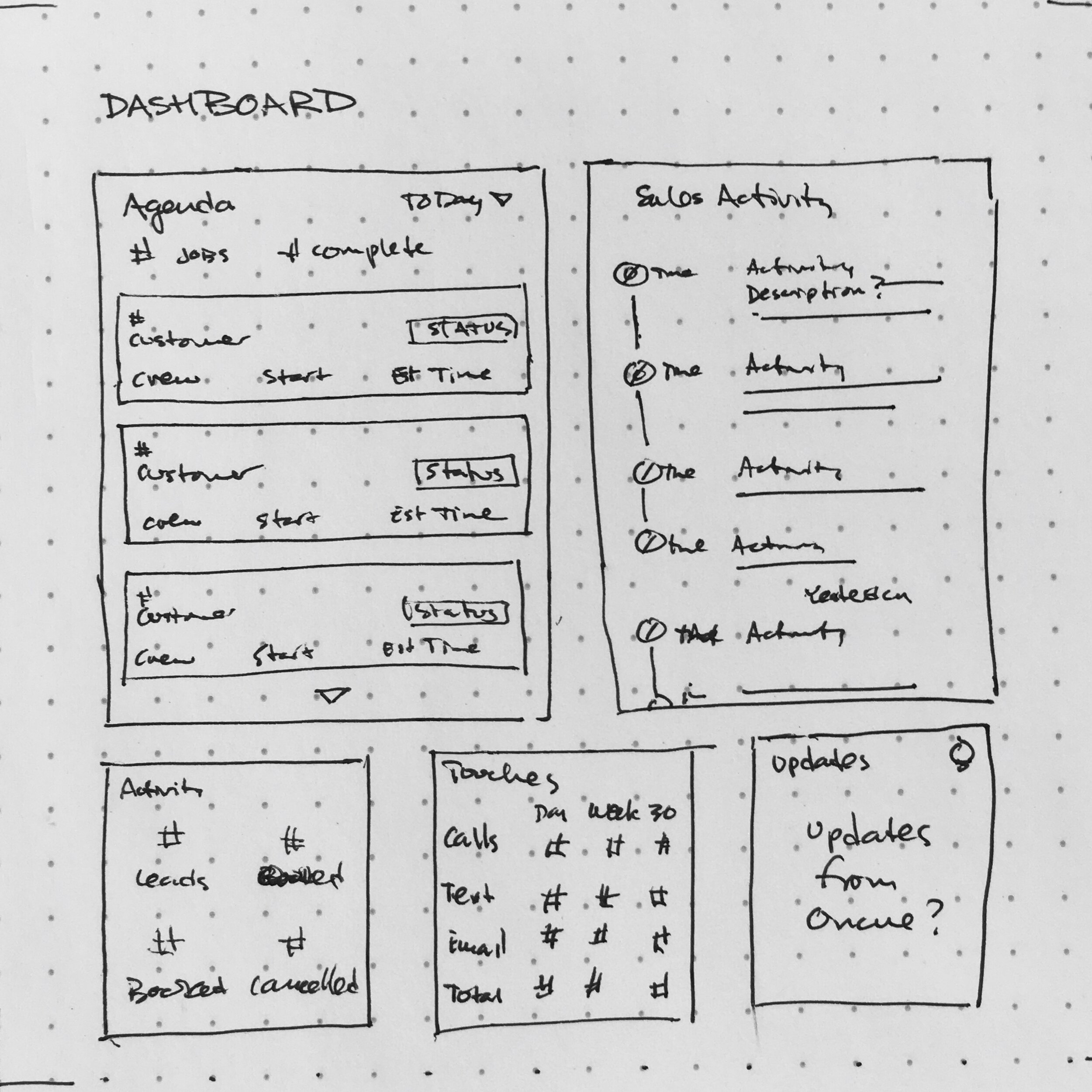
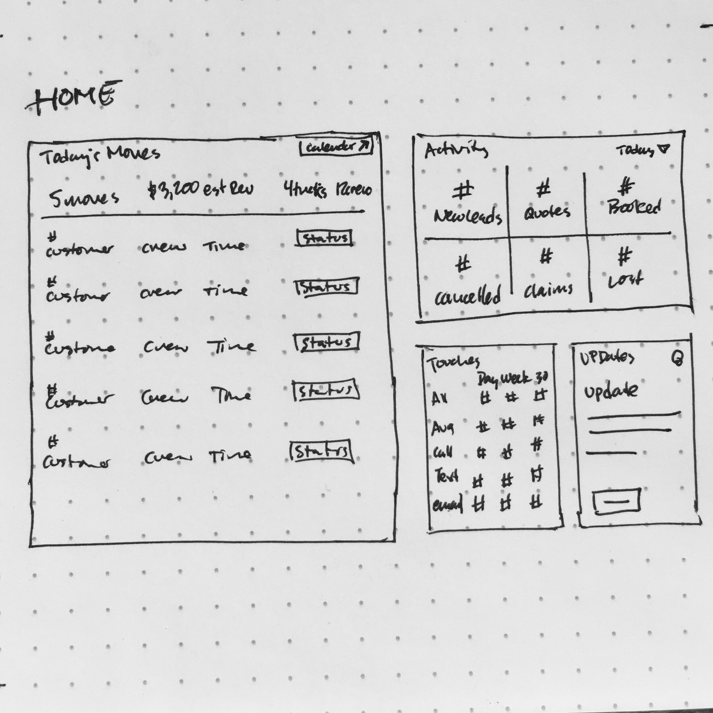
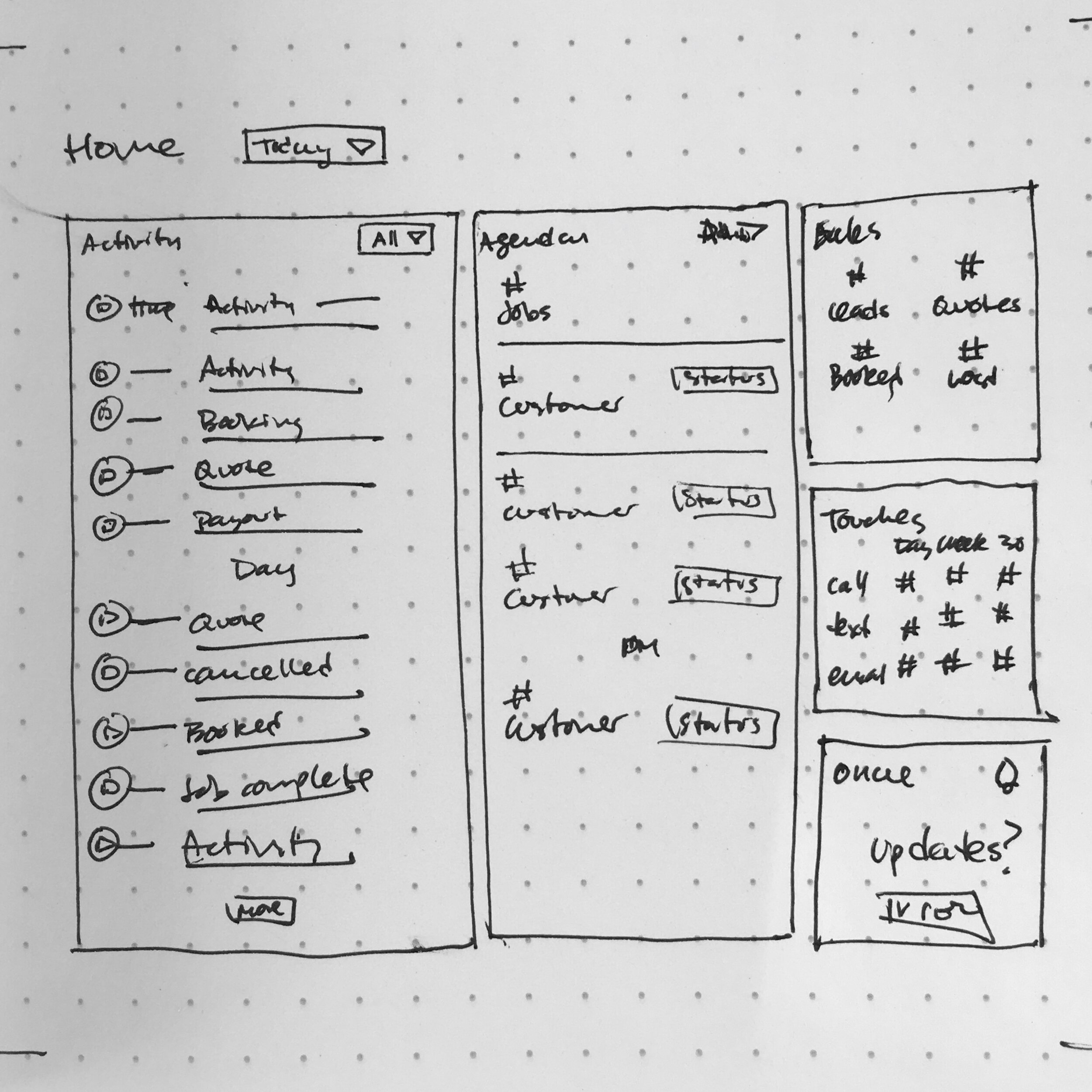
Based on research and feedback around existing dashboards and user needs, I created wireframes to express changes to the architecture of certain aspect of the dashboard, and any additional components that we would need to create in development.
These new elements primarily incorporated information architecture changes and transitioned from Bootstrap to a Material UI-based component library.
Wireframes helped to explore layouts that would keep high priority content above the fold.
Information Architecture
The goal was to redistribute non-essential data to appropriately sections within the existing architecture of the platform. From the dashboard, users are able to gain a high-level perspective and drill in by navigating into various sections.
This required a significant effort to map out the existing display of data and create new pathways for users to follow. Of course, some sections required major overhauls to handle the display of additional data.
Users can quickly navigate to points of interest, with significant sections including: Calendars and Dispatch, Sales, Jobs, Claims, and individual Customer Records. In doing so, I as able to reduce the display load of the dashboard and focus on surfacing key data and information.
Previous versions of the Oncue platform did not have direct pathways to link this data together across sections.
UI Design Exploration
UI was created primarily with Figma utilizing Material UI and Material design principles. The previous dashboard design was undertaken in Sketch using stock Bootstrap.
Architecture changes removed the need for tabbed navigation and significantly reduced the sheer volume of data presented on the dashboard.
A card-based layout was retained to facilitate designing a responsive platform. A simple color palette was selected to represent hero data and color coded to represent both positive and negative connotations.
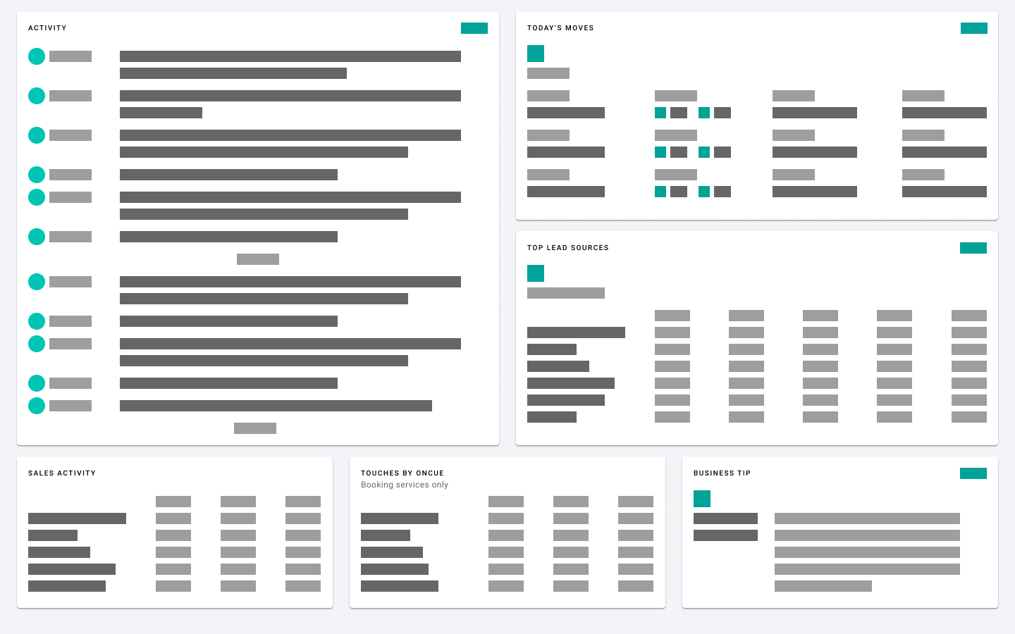
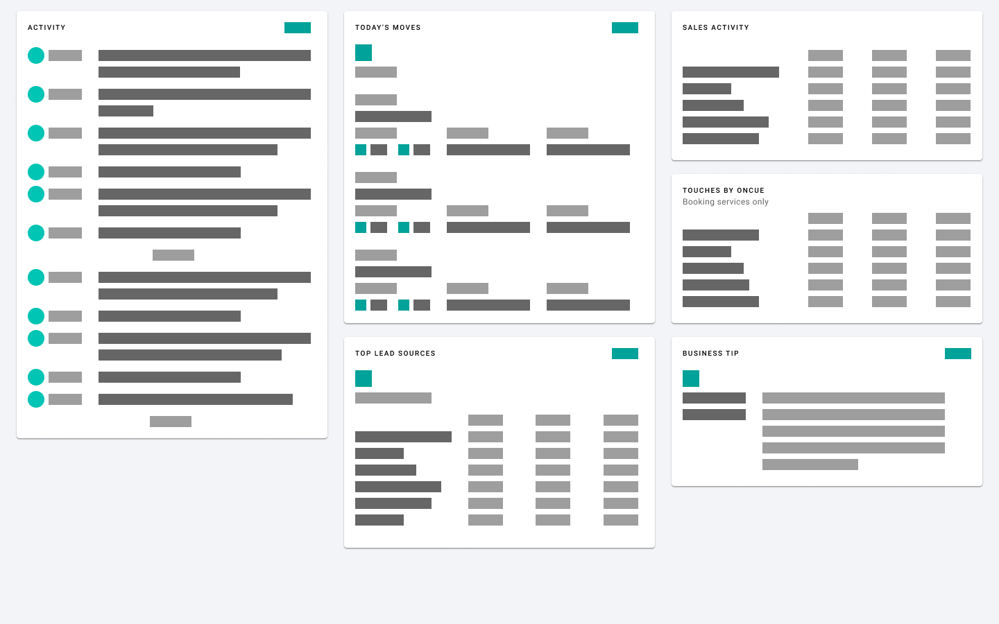
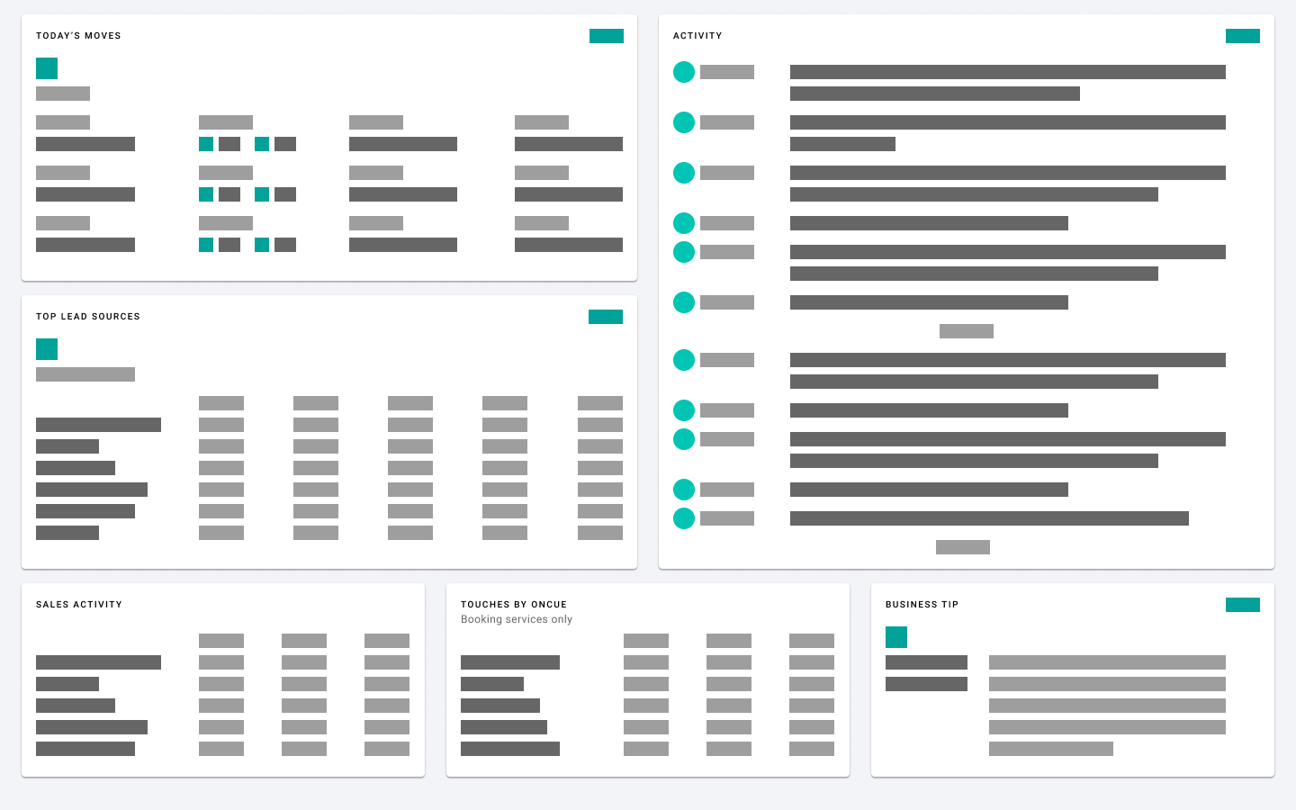
Below are mockups of the card-based analytics dashboard. Note that these displays are data-rich but allow for access to specific sections such as lead sources, sales, and revenue directly from the dashboard.


Below is a card-based UI mockup with emphasis on day-to-day agenda, realtime sales updates, high level lead statistics, and other useful information. I consider this to be a portal view focused on high level information allowing users to drill down when necessary or desired.

Development
The engineering development, testing, and launch of the new analytics dashboard is ongoing.
At the time of my departure from Oncue, development was moving forward by creating navigation and shell in React.
Validation
Thought incomplete, here are some of the proposed methods for validating the changes to the information architecture and UI of the Oncue Dashboard and overall system:
Usability tests and interviews
Click-through tracking from high-level cards
A/B testing of card layout, content, CTAs
Track calls and Intercom messages coming in to Customer Success Team
Final Thoughts
There are a lot of unknowns with this project. Validating designs and prototypes would help to clear up many of these.
A few of my questions and concerns that would need to be addressed include:
Do users prefer a middle ground between a data-rich display and a high-level portal dashboard?
Will current designs of day-to-day agenda and activity feed accommodate larger or higher capacity moving companies?
Will current designs of day-to-day agenda and activity feed be able to accommodate needs of companies during peak moving season (typically summer)?
What impact does piecemeal design change have on users and their perception of the platform?
Can redesign accommodate the future need to have user-specific access and displays?
These and many other questions would need to be addressed during follow up research and evaluation.